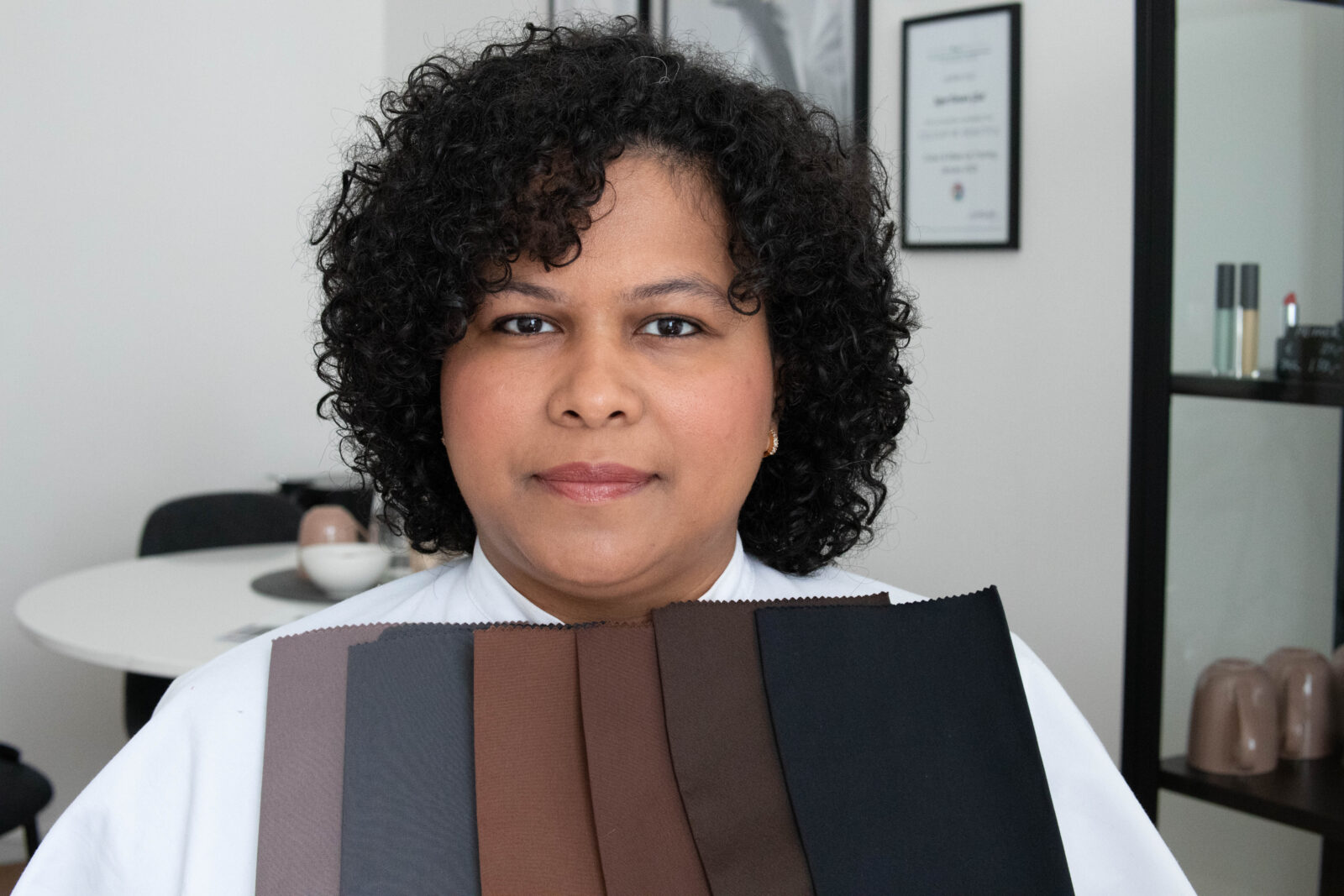
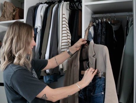
A beautiful DEEP/warm+clear colour type
The short answer to that is no.
I’ve worked with thousands of clients since becoming a certified colour consultant in 2021, and I acknowledge the struggle it can be to figure out what your best colours are due to limited resources online, specifically for people of colour. It’s become a mission of mine to help improve and challenge this very part of colour analysis as best as I possibly can – because colour analysis is and should be inclusive for everyone. Everyone deserves to find the palette that makes them glow! And people with darker skin tones look just as unique and different from one another as people with lighter skin tones.
Traditional colour analysis first appeared in the 80s, and to this day we still often see people with lighter skin at the forefront of ressources on the topic. One of the reasons I fell in love with Tonal Colour Analysis is that we have lots of different options to create a unique palette across different skin tones, including deeper ones. Sure, one of your characteristics could be deep if you have darker skin, it’s something we often see for sure, but it doesn’t have to be the most significant factor to everyone with darker skin. Your clarity for example, can either be soft and muted or it could be clear and contrasting, and then that becomes the dominant factor for your look and your colour palette. There’s ways to work around this with seasonal colour analysis too by the way (here’s a great ressource on that), so I’m not necessarily saying one technique is better than the other. But as that is not a system I personally work with, we’re going to take a different point of view with tonal analysis here.
To help you better understand all this, let’s just dive a little into colour theory, more specifically the Munsell Colour System which is the tool we use to understand colour characteristics across colour analysis techniques:
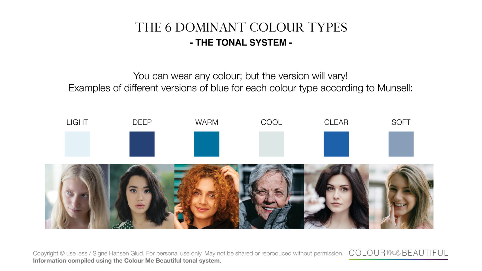
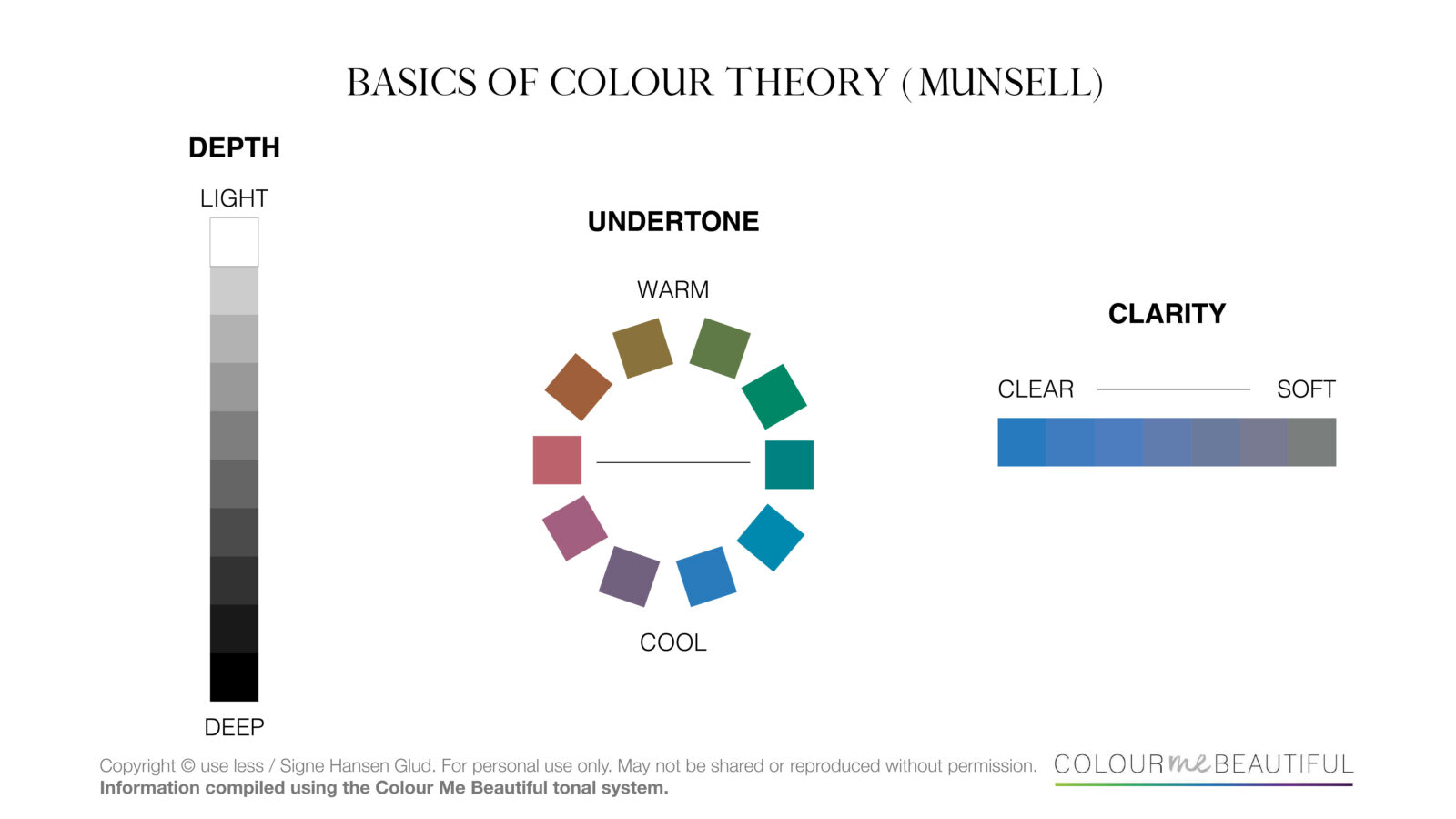
There are 3 main factors we need to consider when deciding on a person’s colouring or simply when describing the character of a single colour.
DEPTH
(also known as value)
Lighter colours, often referred to as pastels, will be more delicate and have more white added to them. Deeper colours become darker and stronger because they have more black added to them. If you’re a light colour type you likely have fair skin and light blonde hair. On the opposite side of that, if you have dark hair and dark coloured eyes, you could be a deep – it’s important to note here, that skintone can vary all the way from black to porcelain though; the depth of your look is very much present in your hair and eyes.
UNDERTONE
(also known as hue)
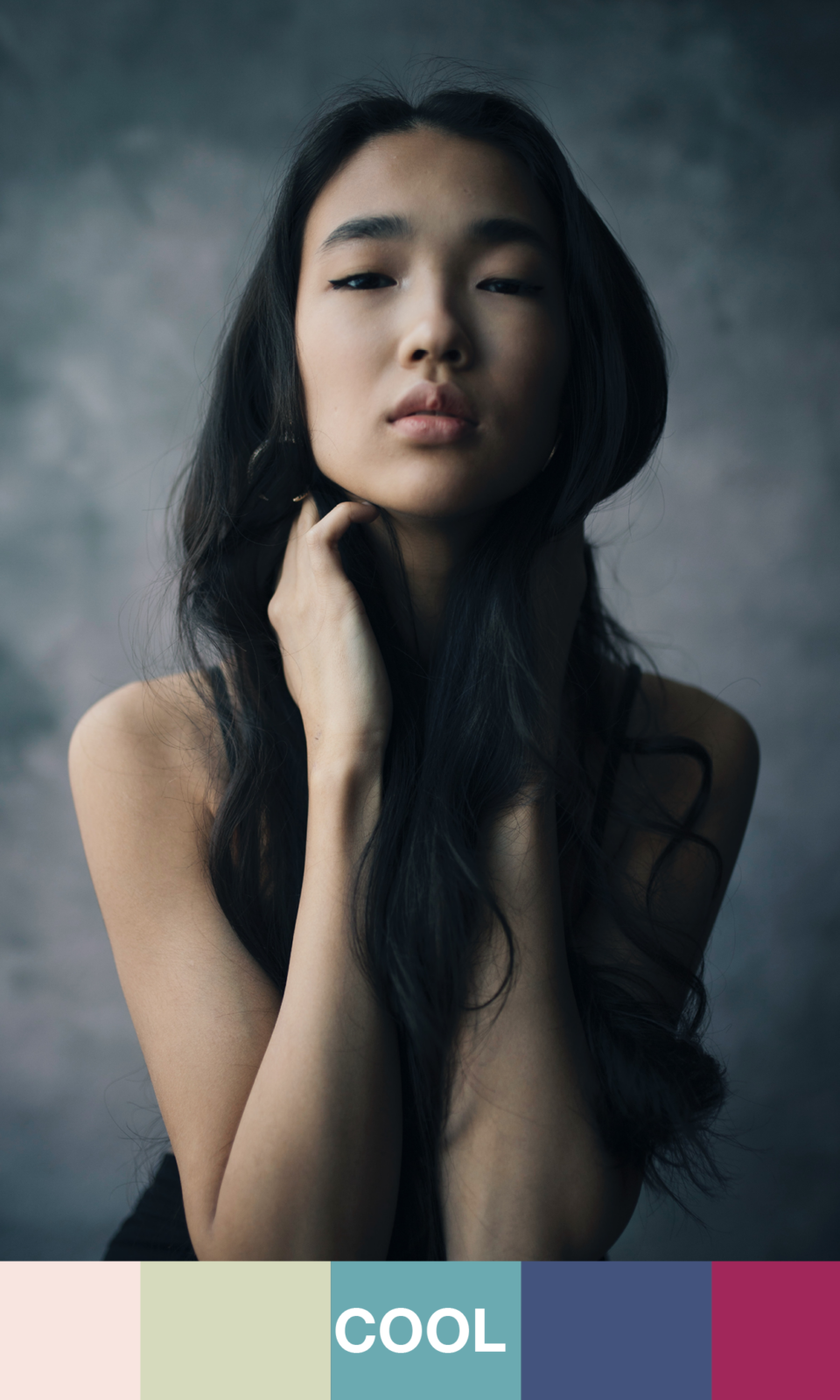
Warm colours will have more yellow in them, making them look more golden whereas cool colours will have more blue added to them, giving them their cool and icy look. Now the discussion around undertone is often what people find most confusing, but it really doesn’t have to be so tricky. Did you know that most people are more neutral in undertone than just warm or cool? That’s right. No wonder why people can’t seem to figure out whether they look better in gold or silver, because chances are you could very well pull off both to a certain extent (one might still look a little more striking than the other though). If however your look is clearly warm – for example reddish hair and a golden skin tone, or clearly cool – grey or pitch black hair and a blueish or rosey tinge to your skin – undertone of course becomes the most significant factor about your look, and you’d look your very best in colours that generally match your undertone, warm or cool.
CLARITY
(also known as chroma)
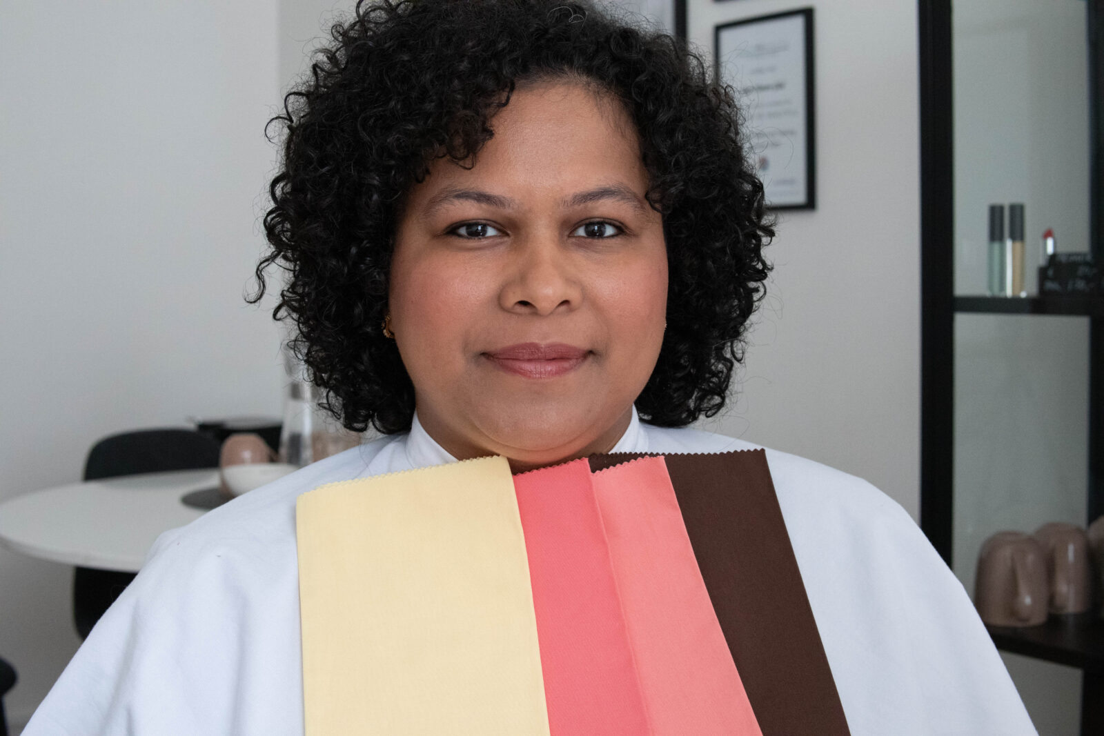
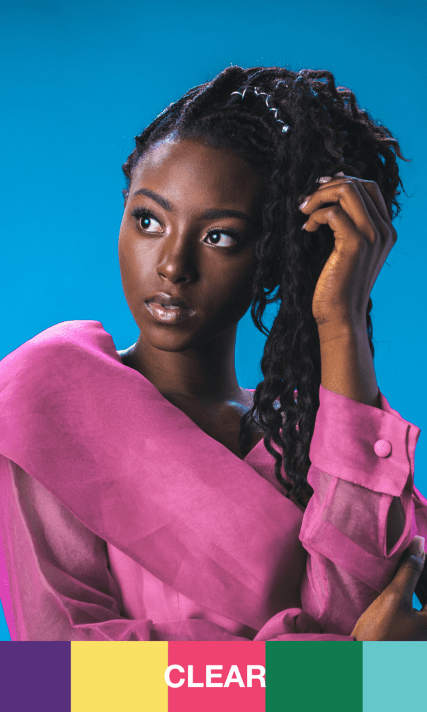
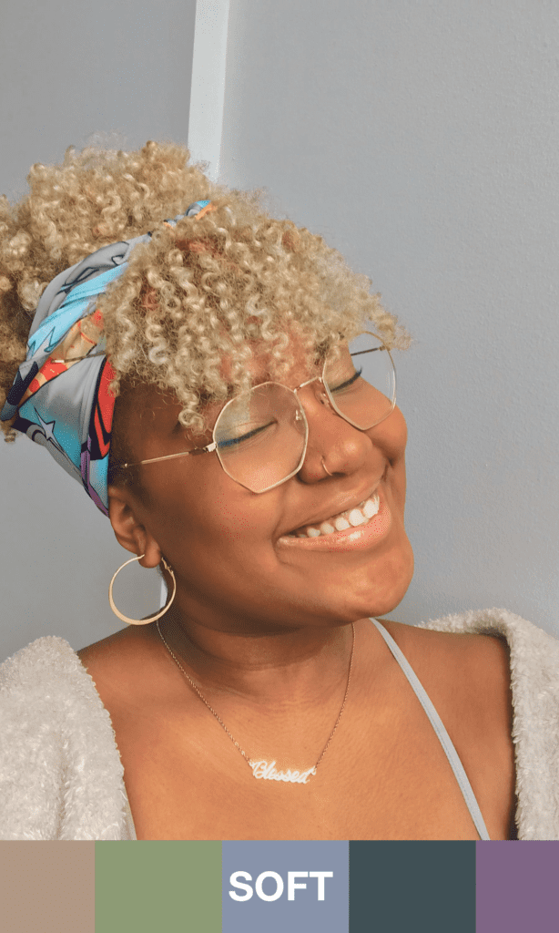
Clear or bright colours will be strong but not dark – they are vivid and pure, they almost bring a tingling sensation to the eye. Whereas soft colours are more muted and calm to look at, thanks to the fact that they have more grey added to them. I always like describing the soft colours as being slightly “punctured” compared to their clear counterpart. If you’re a clear colour type, you may have similarities with a deep, but you will have more contrast in your look between hair, skin and eyes. If you have dark skin, the white in your eyes might pop or you have a big, pearly white smile. And if you’re a soft you will have lower contrast between your features, for example medium depth skin, light brown hair or hair with highlights and a muted eye colour.
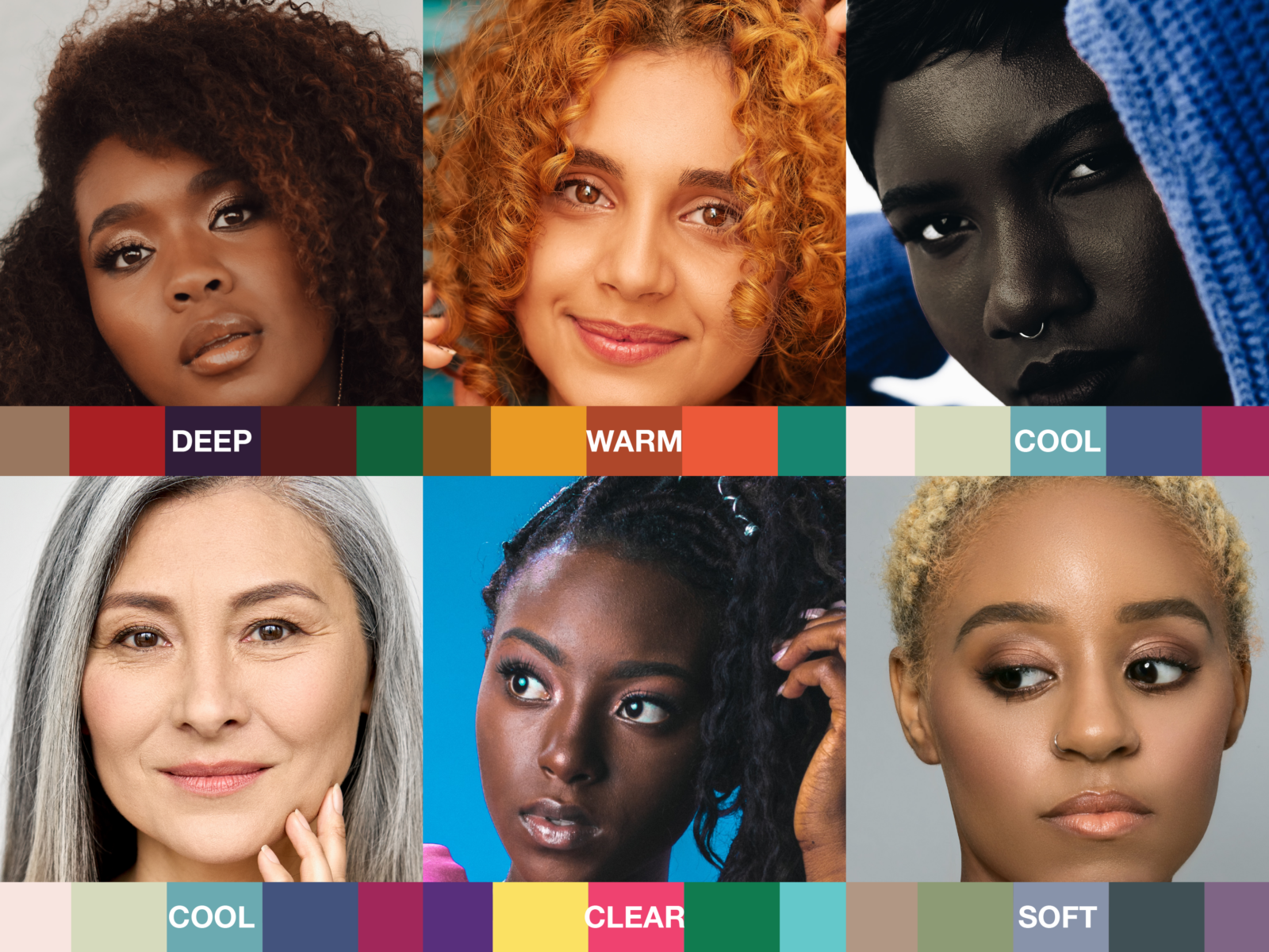
There are of course many examples we could include because we all have our unique features – but above you’ll hopefully get a better idea of just how different people of colour could be typed with the tonal system.
I also want to add that there’s a reason why colour consultants love their technical coloured testing drapes so much: whenever you’re in doubt, forget about the stereotypical guidelines you may find online, use your eyes and try colours of different characteristics on in real life instead, exactly as we would do during in-person colour analysis testing. Pigeon-holing yourself into a stereotype can be more confusing than helpful, and at the end of the day it’s all about how the different colours impact your face in real life. We’re looking to create harmony and balance with the colour you wear and in that way enhance your natural beauty.
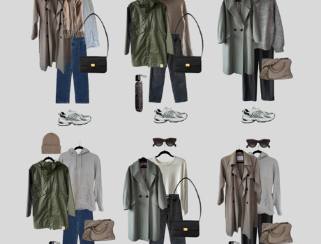
A few more examples

Both these women have similar features: dark hair and dark eyes, meaning they would both look striking in deep and rich colours. However, the woman on the left side has slightly more warmth in her look and the dominant DEEP palette (which has a mix of both warm and cool colours – their main factor is simply that they are deep and strong) would look absolutely amazing on her. The woman to the right has little to no warmth in her look (olive skin, pitch black hair and cool brown eyes), and therefore the dominantly COOL palette would be a more striking choice for her. Because of the depth in her look though, she might still look her very best in mid- to deeper colours, and the lighter shades could be worn in combination with a slightly darker one.
In this example we yet again have two women with similar, deep features. However, in this case the dominant DEEP palette would look heavy and overpowering on both of them. That’s because the most significant factor about both each their look is the clarity, and therefore depth becomes more of a secondary keyword. The woman to the left has high contrast between her skin, hair and eye colour – especially the iris of her eyes really pop. She would look more striking in a palette made up of clear and contrasting colours. On the opposite side we have a woman who has a significantly softer look: her medium depth skin tone with the highlighted hair gives her a soft appearance which would look lovely with the SOFT colour palette.
In this post we’ve explored the 6 dominant colour types for tonal colour analysis – in reality, we actually have 24 types in total with this way of analysing! That’s because once we’ve established your dominant – the most important colour descriptor for you – we’ll move on to your secondary characteristics to finetune your unique palette further. So for example, you could be a DEEP/warm+clear (like the woman in the first few photos of this post) or a SOFT/cool+light like me. If you’d like to learn more, have a look here.


This tech guru @prompttechrecovery on Telegram is a Great tech professional to work with. The tech genius helped me recover $317,800 of my crypto assets that were stolen by a fake Crypto investment platform. He was very professional during the recovery process and helped solve several issues I encountered. He was very patient even when I asked for some clarifications. Thank you for all your help @prompttech, you are excellent at your job. Just send them a Telegram Chat: @prompttechrecovery, or Email: prompttechrecovery @ gmail. com
My name is Wendy Taylor, I’m from Los Angeles, i want to announce to you Viewer how Capital Crypto Recover help me to restore my Lost Bitcoin, I invested with a Crypto broker without proper research to know what I was hoarding my hard-earned money into scammers, i lost access to my crypto wallet or had your funds stolen? Don’t worry Capital Crypto Recover is here to help you recover your cryptocurrency with cutting-edge technical expertise, With years of experience in the crypto world, Capital Crypto Recover employs the best latest tools and ethical hacking techniques to help you recover lost assets, unlock hacked accounts, Whether it’s a forgotten password, Capital Crypto Recover has the expertise to help you get your crypto back. a security company service that has a 100% success rate in the recovery of crypto assets, i lost wallet and hacked accounts. I provided them the information they requested and they began their investigation. To my surprise, Capital Crypto Recover was able to trace and recover my crypto assets successfully within 24hours. Thank you for your service in helping me recover my $647,734 worth of crypto funds and I highly recommend their recovery services, they are reliable and a trusted company to any individuals looking to recover lost money. Contact email Capitalcryptorecover@zohomail. com OR Telegram @Capitalcryptorecover Call/Text Number +1 (336)390-6684 his contact: Recovercapital @ cyberservices. com
The truly scary thing about undiscovered lies is that they have a greater capacity to diminish us than exposed ones. When people cheat in any arena, they diminish themselves-they threaten their own self-esteem and their relationships with others by undermining the trust they have in their ability to succeed and in their ability to be true. Cheating is the most disrespectful thing one human being can do to another. If you aren’t happy in a relationship, end it before starting another one.
Those who cheat on their partners who are loyal to them; don’t deserve them. It is a trashy attitude to disrespect a person who is loyal in a relationship, by cheating on him or her.
If you succeed in cheating someone, don’t think that the person is a fool and realize that the person trusted you much more than you deserve.
If you notice any suspicious act on your partner if he or she is cheating, then you need to
contact (Webroothacker (@) gmal com) to help you remotely spoof on the target phone to retrieve text messages, call logs, social media activities, bank information and many more. They deliver the best services and get you the peace of mind you deserve.
We are here to help everyone erase their criminal records , DUIs , bad driving records and other criminal records needed without any mishap .We have the Real registered drivers license, Illinois state id requirements, Illinois id requirements , what do you need to get your license Illinois how to get a new drivers license illinois , Fake Malaysian passport , credit card hack software, Fake UK Passports , Fake Bank Statement , Fake bank statement for loan , How To Get A Driver’s License in Ontario And British Columbia and good quality Fake Driver License will be verify from any other country with no problems involved, meanwhile with the camouflage quality Fake drivers License , non of your biometric details will be under the government system, but it can not be detected as fake with naked eyes. We also help people with DUI and other criminal records erased without any mishap , how to get your DUI erased is a problem which is solved here.
Now email us today at our E-mail address at: { qualitydocuments9@gmail.com }
Visit our website on : noveltydmvexperts.com
Thanks and waiting to Hear from you soonense for USA , UK , Canada which is unregistered. Real Estate License , How To Get A Fake Drivers License That Works From The DMV . Belgian driving license , Irish driver License , Fake drivers license nsw , How to spot a fake id Australia .With the Drivers License , all your biometric details as given from birth or How to Easily Order for a fake driver License online from the comfort of your home . Meanwhile in UK , you can easily obtain a Fake Driving Licence UK Online without any driving test. Welcome to Novelty DMV Experts Best Producers of High Undetected Drivers License . We produce two types of documents qualities. Both real and fake drivers License . We also offer quality Irish Drivers License for Irish Citizens.
Where to easily obtain Registered Passports , IDs , ssn , drives license that works from the database system for various Countries . We also provide , Fake birth certificate with raised seal . you can also get fake divorce papers , Forged Passports , False Passport , Fake UK Documents , Valid German driving Licence , Welcome to Octapustickets Group of Experts Best Producers of High Undetected Drivers License . We produce two types of documents qualities. We have the Real registered Fake birth Certificate, Fake Divorce papers , and good quality Fake Driver License will be verify from any other country database system with no problems involved, meanwhile with the camouflage quality Fake drivers License , non of your biometric details will be under the government system, but it can not be detected as fake with naked eyes, except with the use of machines.
We also help provide easy methods on How to become a real Portuguese citizenship smoothly. the use of machines. We also help you Clear your Criminal record from any countries court system or criminal records database system.
Download the Telegram APP and Text us at : @OCTAPUSTICKET for more informations an orders. email us today at our E-mail address at: { octapustickets@gmail.com }
Visit our website on octapustickets.com
Thanks and waiting to Hear from you soonense.
What is the best crypto asset recovery service provider? Hire Captain WebGenesis Crypto Recovery Center
Captain WebGenesis Crypto Recovery Center boasts a team of seasoned professionals with extensive knowledge of blockchain technology and cryptocurrency recovery. Their expertise is unparalleled, which sets them apart from other recovery companies. Captain WebGenesis Crypto Recovery Center has a long list of satisfied clients who have successfully recovered their lost funds. Testimonials from previous victims highlight their professionalism, dedication, and effective communication throughout the recovery process. Knowing that others have successfully reclaimed their assets will give you the confidence to move forward.
Contact Info;
WhatsApp : (+1,501,436,93,62)
Website; https://captainwebgenesis.com
I was recently scammed out of $53,000 by a fraudulent Bitcoin investment scheme, which added significant stress to my already difficult health issues, as I was also facing cancer surgery expenses. Desperate to recover my funds, I spent hours researching and consulting other victims, which led me to discover the excellent reputation of Capital Crypto Recover, I came across a Google post It was only after spending many hours researching and asking other victims for advice that I discovered Capital Crypto Recovery’s stellar reputation. I decided to contact them because of their successful recovery record and encouraging client testimonials. I had no idea that this would be the pivotal moment in my fight against cryptocurrency theft. Thanks to their expert team, I was able to recover my lost cryptocurrency back. The process was intricate, but Capital Crypto Recovery’s commitment to utilizing the latest technology ensured a successful outcome. I highly recommend their services to anyone who has fallen victim to cryptocurrency fraud. For assistance, contact Recovercapital@cyberservices. com Capital Crypto Recover on Telegram OR Call Number +1 (336)390-6684 via email: Capitalcryptorecover AT zohomail. com
It is hard to believe this but it is true you can spy on whoever you want to remotely from anywhere in the world and get any data you want to get from anywhere with the help of Brillianthackers800 AT gmail DOT com, trust me you can count on this team, you can also get through to them via WhatsApp: +14106350697, All you need to do is try, That is all i did and they came through good.
Hello everyone I want to sincerely thank the amazing and trustworthy Asset Recovery Team at TROYHACKS CYBER SECURITY COMPANY for helping me get back all of the USDT I lost to a fraudulent Binary Trading Company. I truly don’t know what would have happened to me if it weren’t for the assistance TROYHACKS RECOVERY TEAM provided. These people are truly incredible, and I’m incredibly amazed by their fantastic service and skill in the recovery process of my funds. It all began when I placed $217k in a binary trading option platform. A few months later, I tried to withdraw some money from my bank, but it didn’t go through. I promptly reached out to the platform’s customer service by phone and email, but I never heard back. A few days later, I received an email from them asking me to increase my investments in order to reach the point where I could withdraw my money. I declined, and I never heard from them again, which is when I realised I was in serious trouble. I felt terrible that my hard-earned money was gone, and I was truly sad at the time. After several months, I found numerous Google testimonials describing how TROYHACKS CYBER SECURITY COMPANY , whose contact information is (Troyhacks@cyberservices.com), WhatsApp +1(260) 237-6241 had assisted numerous victims in getting their money back that had been stolen, defrauded, or tricked out of bitcoin or any other type of digital currency. They offered to assist me in getting my money back when I contacted them, and I gave them the information they requested concerning the business I had invested in. They went on with the recovery process, and the outcome was fantastic . I received all of my lost USDT back in a matter of days. I was ecstatic because I never thought I would receive my money back. Once more, all thanks to TROYHACKS RECOVERY FIRM and their excellent set of well trained cyber experts.
Retrieve Your Stolen Cryptocurrency/BTC With “SPYHOST” . They have a track record of successful cryptocurrency recovery, the firm has assisted several clients in recovering their lost or stolen digital assets. This is one of the best financial recovery agencies with highly skilled experts that have a thorough understanding of the complicated workings of the blockchain and the numerous cryptocurrencies, allowing them to rapidly recover lost assets. Contact them Via; Mail Box; (Spyhost@cyberdude. com)
Whats Ap; + 1 (228) 313‑3152
Can lost Bitcoin be Found or Retrieved?
Generally speaking, whether
lost bitcoin can be found or not depends on how it was lost. Considering
the quantity of missing cryptocurrency out there, people have begun
offering services to help recover lost bitcoin. These include data
recovery specialists, but you need a professional recovery expert like[
COINSRECOVERYWORLDWIDE@GMAIL.COM] to help you get back your lost bitcoin.
Contact them to
recover lost bitcoin, bitcoin cash, as well as all other forms of
cryptocurrency. And you can be sure that no matter how long it has been
lost, you will still get your bitcoin worth.EMAIL [COINSRECOVERYWORLDWIDE@GMAIL.COM],whatsapp [+1 447-285-9233]
I was recently scammed out of $53,000 by a fraudulent Bitcoin investment scheme, which added significant stress to my already difficult health issues, as I was also facing cancer surgery expenses. Desperate to recover my funds, I spent hours researching and consulting other victims, which led me to discover the excellent reputation of Capital Crypto Recover, I came across a Google post It was only after spending many hours researching and asking other victims for advice that I discovered Capital Crypto Recovery’s stellar reputation. I decided to contact them because of their successful recovery record and encouraging client testimonials. I had no idea that this would be the pivotal moment in my fight against cryptocurrency theft. Thanks to their expert team, I was able to recover my lost cryptocurrency back. The process was intricate, but Capital Crypto Recovery’s commitment to utilizing the latest technology ensured a successful outcome. I highly recommend their services to anyone who has fallen victim to cryptocurrency fraud. For assistance, contact Recovercapital AT cyberservices. com Capital Crypto Recover on Telegram OR Call Number +1 (336)390-6684 via email: Capitalcryptorecover AT zohomail. com